The MUI X Date and Time Pickers get a stable v5 release
About four months ago, we moved the date and time pickers from @mui/lab and released the first alpha version of the date pickers package.
We have focused on improving stability and developer experience since then, and now, we’re happy to announce the first official @mui/x-date-pickers v5 release.
TL;DR
- The beta phase is over. You can now download
v5.0.0. - Dozens of bugs have been fixed since the first alpha.
- DX and overall API consistency have been improved.
- Improved customizability.
- Follow the installation instructions and the migration guide.
What's changed?
Documentation
We revamped the getting started page to ease the burden with installation, and improved sections that are key to customization, like the documentation of component slots.
Bug fixes and other issues
More than 150 issues were solved during the pre-releases (alpha/beta), including the epic refactoring of the date/time selection behavior, which has clarified edge cases about how a date is selected, accepted, dismissed, and which callbacks are triggered when.
A big thanks to all the contributors who took the time to clarify the edge cases they faced. It's been a huge help in refining the components behavior.

Better APIs and improved customization
The property names and customization strategies were standardized to flatten the learning curve.
For example, the MonthPicker’s prop onMonthChange and the YearPicker’s prop onYearChange have both been renamed to onChange.
We also added new customizable slots:
ActionBarlets you customize the actions below the picker. It replaces the propsclearable,showTodayButton,cancelText,okTextPaperContentlets you add custom elements in the desktop viewTabslets you customize the tab used to switch between date and time view
Integrated localization
It’s not obvious at first glance, but the pickers do contain some textual information, including action buttons as well as aria-labels for accessibility support.
We integrated a new localization pipeline similar to the one used by the Data Grid. It lets you import translations directly into the main theme in a few lines. And thanks to the amazing contributors, translations for 11 languages are already available.
import { createTheme, ThemeProvider } from '@mui/material/styles';
import { DataGrid, bgBG as dataGridBgBG } from '@mui/x-data-grid';
import { bgBG as coreBgBG } from '@mui/material/locale';
import bgLocale from 'date-fns/locale/bg';
import { CalendarPicker, LocalizationProvider, bgBG } from '@mui/x-date-pickers';
import { AdapterDayjs } from '@mui/x-date-pickers/AdapterDayjs';

const theme = createTheme(
  {
    palette: {
      primary: { main: '#1976d2' },
    },
  },
  bgBG, // x-date-pickers translations
  dataGridBgBG, // x-data-grid translations
  coreBgBG, // core translations
);
Community migration
With all those changes, we wondered if the community has been interested in the new versions.
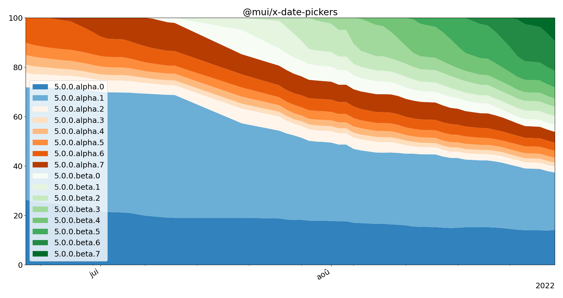
According to npm download data, less than 40% of the community still uses the versions in @mui/lab (alpha.0 and alpha.1).
So a significant share has already migrated.
And the adoption speed across versions is very encouraging. Over 40% of users are already using the beta versions.

Relative distribution of `@mui/x-date-pickers` versions between June and August.
Installation and migration from @mui/lab
You can find the installation instructions in our getting started page.
If you are migrating from the @mui/lab package, we’ve prepared a migration guide to support you, including a codemod to replace the date pickers declarations.
What to expect next?
After working on stability and developer experience, we’re now pushing to improve the usability of the components.
We’ve been exploring different approaches and implementations for the date fields, and we’ll soon release a v6 alpha version to start iterating on the new and improved components.
You can expect support for v5 stable release with patches for critical bugs, but we encourage the community to help us build the next generation of date pickers and migrate whenever possible to the v6 pre-releases.
If you want to help steer the direction of the new components, please consider contacting us to schedule a 30-minute user interview session. We’re working on MUI X v6, and we’d love to hear more about your pain points and use cases.